A17 — Growth marketing agency
Logo and design system for a growth marketing agency.
A17 is a growth marketing agency focused exclusively on the maritime sector. The project brief called for building a brand identity from the ground up — starting with the logo and extending into a complete design system. The key challenge was to reflect the specifics of the industry while creating a visual identity that feels both credible and distinctive.
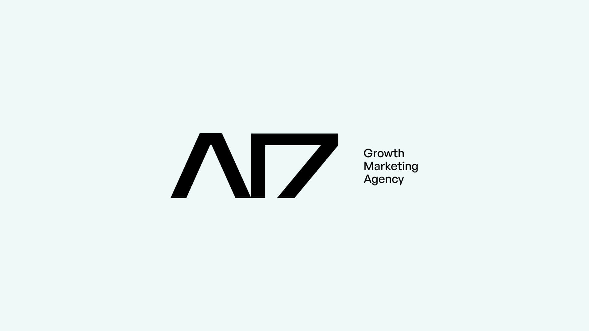
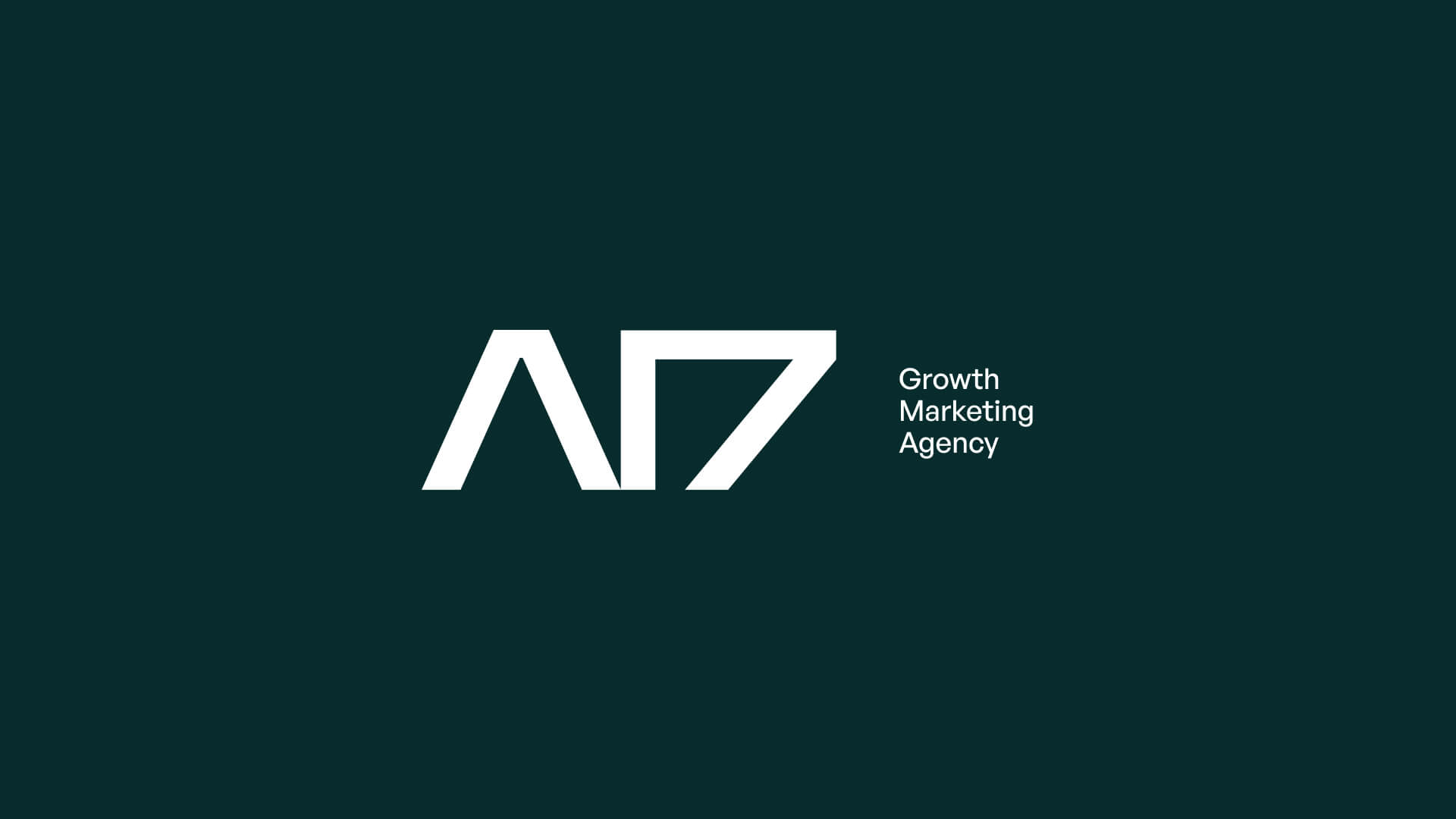
The logo concept is built around the fusion of two ideas — the A17 letterform and the silhouette of a ship. From this synthesis emerged a strict geometric mark: a triangular sail shape embedded into the structure of the characters, forming a single, indivisible symbol. No illustrative detail, no decoration — just clean geometry where the maritime reference reads naturally and without effort.
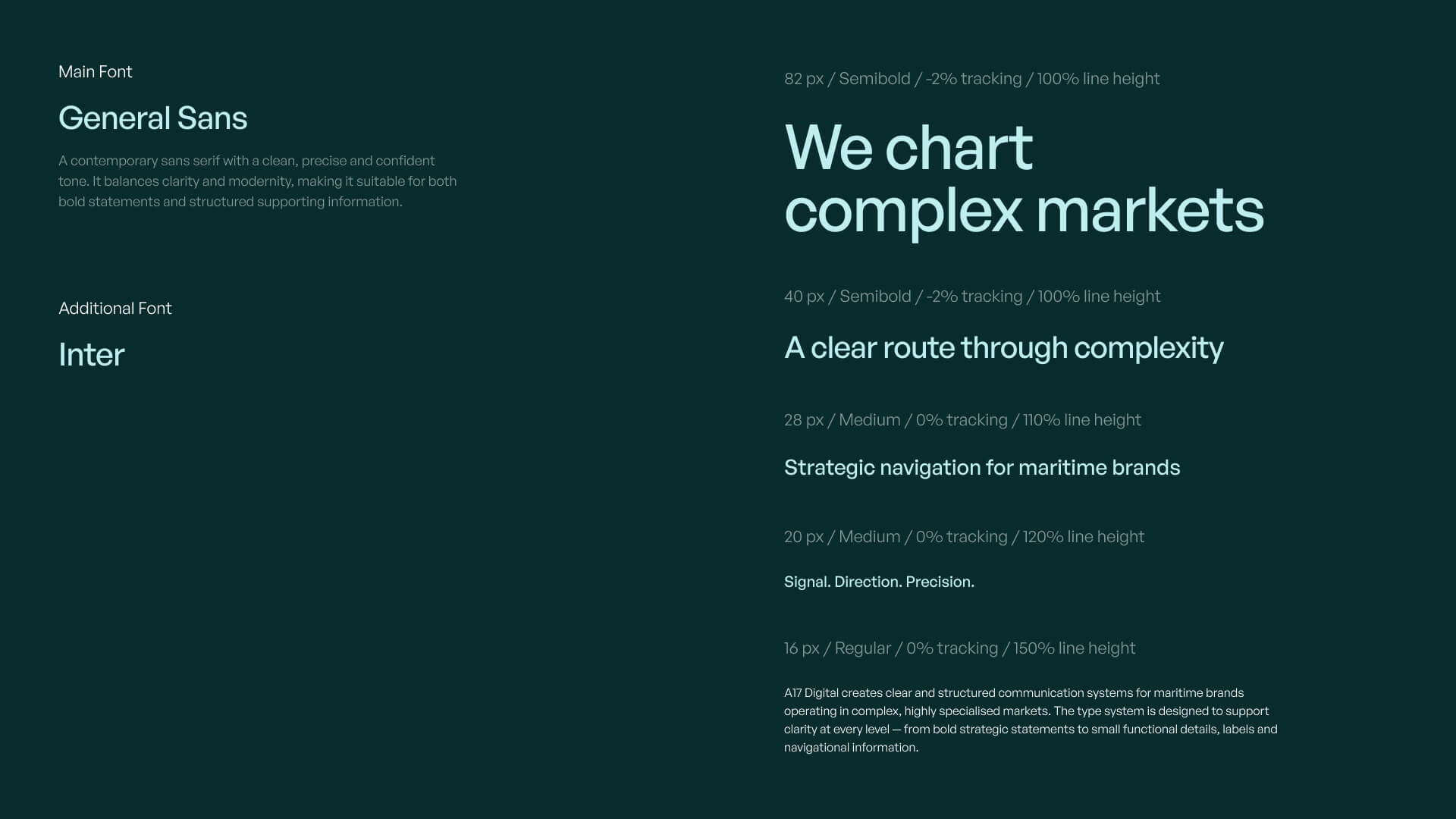
The design system is anchored by a deep teal brand color and a clean sans-serif typeface. It provides a consistent visual language across all brand touchpoints — from digital channels to print materials — ensuring the agency communicates with clarity and coherence at every scale.